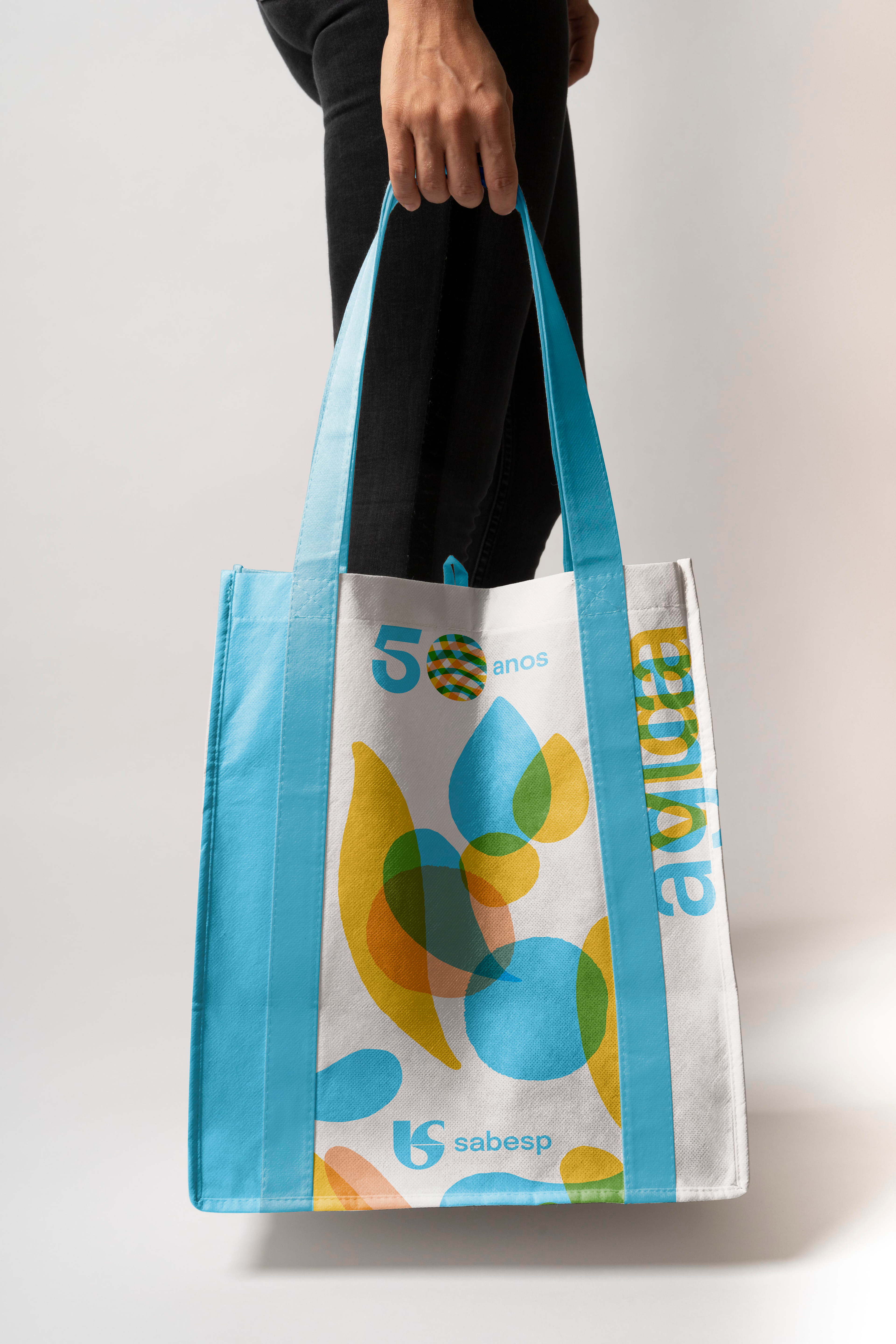
To create the visual identity for Sabesp's 50th anniversary, we immersed ourselves in the brand’s culture to uncover its essence. We recognized the importance of highlighting the company’s expertise and social impact—elements often invisible to the average consumer. Inspired by watercolor art, the identity blends water, vibrant colors, and organic shapes to emphasize the human side of the brand. The anniversary celebration logo was designed with multiple versions and forms, symbolizing the dynamic and diverse range of services Sabesp provides.
Through frame-by-frame animations and concepts like growth and confluence, we developed visuals that embodied movement and fluidity.
This approach resonated so well that the visual style was adopted into Sabesp’s corporate identity, transforming building facades, uniforms,
water tanks, vehicle fleets, and more.
The result is a celebration of 50 years that not only commemorates Sabesp’s legacy but also breathes new life into its image,
reinforcing its commitment to people and progress.

FutureBrand Team
Direção criativa / Creative direction — Lucas Machado
Design — Sofia Ohanna
Identidade verbal / Verbal identity — Victória Oliveira
Frame by Frame Animations — Sofia Ohanna
Animação / Motion graphics — Francisco Fernandes, César Quirino
Frame by Frame Animations — Sofia Ohanna
Animação / Motion graphics — Francisco Fernandes, César Quirino
Gestão de Projeto / Account – Cecília Faoro
