
Considered the largest exporter of organic sugar in the world, the impact of the sugar and energy company Jalles goes far beyond its hometown, Goianésia-GO. With 40 years of history, it has played a fundamental role in the socio-economic development of the city, becoming a model of legacy and leadership. Its wide range of products and services (organic products, sanitizers, energy) is the result of a great concern with the maximum reuse of its main raw material, sugarcane.
With the aim of maintaining a constant search for innovation in the service of the environment, Jalles has sought to always be aligned with sustainable production practices. The company already collects a wide variety of certificates related to sustainability, fair trade, quality and safety of work and its products.
In 2022, the desire arose to translate this sustainable essence into a new brand. Thus, a company with such a consolidated history now assumes a new positioning and a new visual identity, which represents the strength of its legacy with a modern and warm approach.

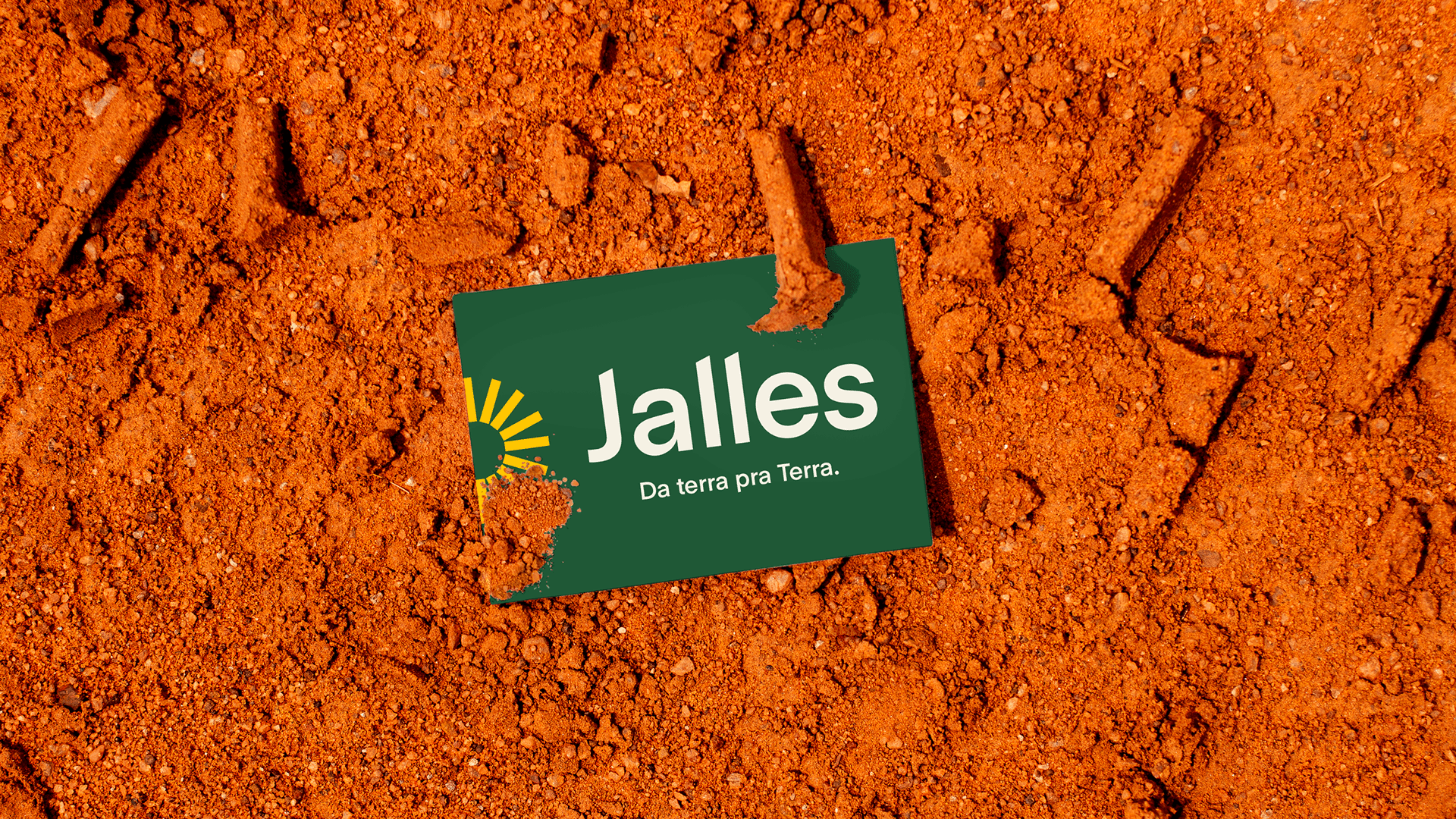

The challenge for Futurebrand São Paulo was to show Jalles' determination to be a sustainable and innovative brand, without losing its connection to its legacy and experience. The goal was to maintain the company's relevance and make its values even more easily recognizable.
The new logo also carries a strong strategic change for the new brand: the reduction of the old name Jalles Machado to just Jalles. In Goianésia, Jalles is a company known for their friendly environment and concern for the well-being of their employees. During a visit to the city, it is possible to notice that their name is being spoken and used everywhere. Therefore, they reinforce this casualness and present themselves as equals - like good friends. "Jalles. Just Jalles."
Like Jalles, we created a logo that is easily recognizable and friendly. We used details that, in a non-literal way, refer to sugarcane. The logo features angled cuts in the stems of its letters, like the cuts made in sugarcane. In the letter "a", we reinforced the organic lines, like the curves present in the foliage of the sugarcane field.


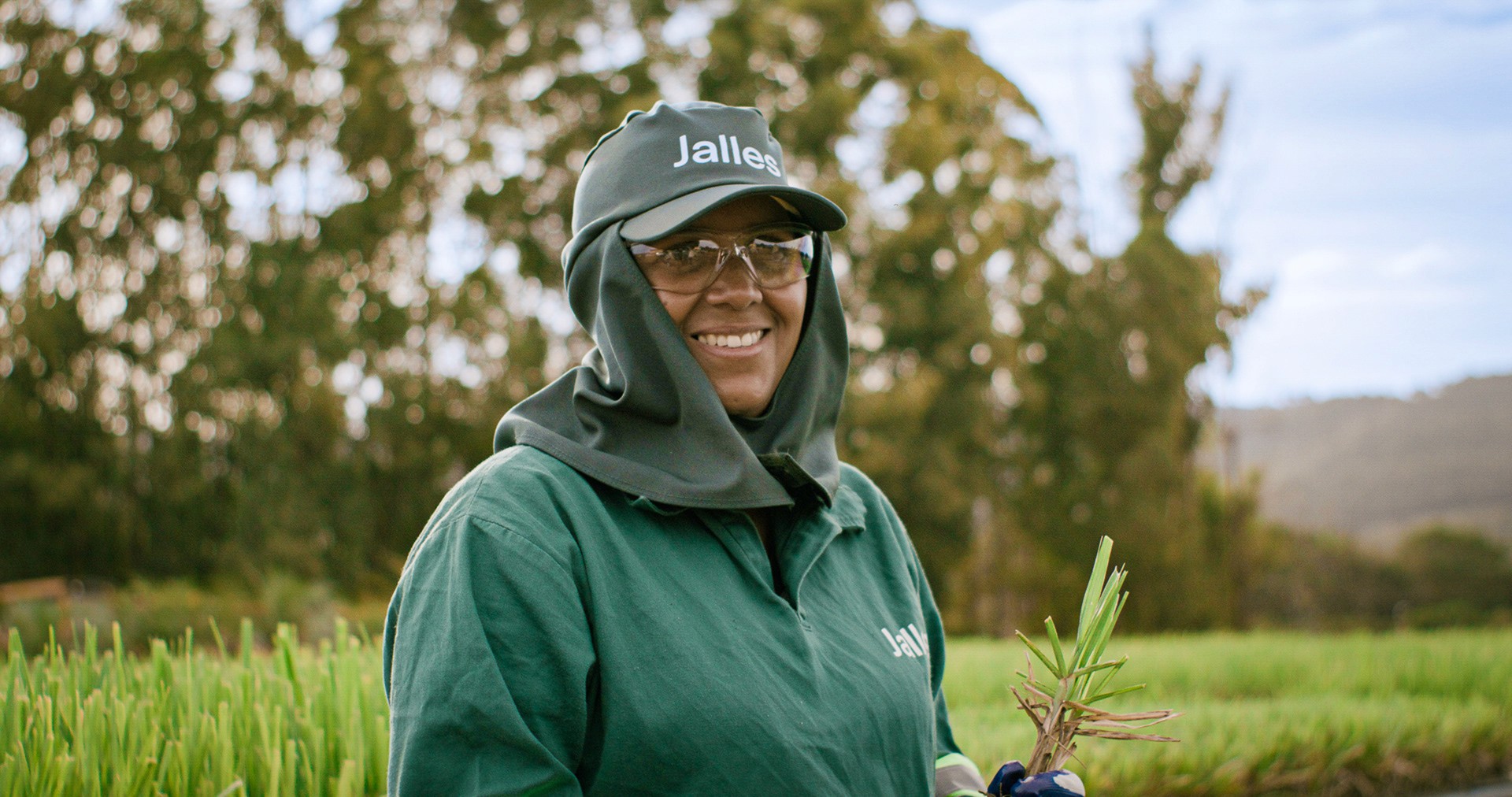
Jalles now presents a new symbol as a reduction of their logo. This was designed as a reinterpretation of a symbol used in one of the company's old logos from 1983. The old symbol was a composition of 3 letters, created from the same structure as the others in the logo, referring to the letters D, J, and also M.
We maintained the reduction of three letters, with even more similar structures. By repeating the new stems, we represent the reverberation of Jalles' legacy and their motivation to move forward, while keeping replanting and staying constantly updated.


As a way to guide the strategy and identity of their new moment, we created Jalles' new purpose of "Energizing a positive future". From the beginning, Jalles has been a guiding thread between the nature and technology, the individual and society, legacy and future. We believe these are
the tensions that generate the energy that drives the company and its employees.
This purpose led us to create a captivating visual identity in every aspect, with joyful and
energetic visual elements that connect to nature to reflect the well-being that Jalles wants
to bring to everyone's life.
The creation of Jalles' color palette was entirely motivated by the characteristics of their activity, following nature inspirations. We created a palette with a greater predominance of green to reinforce their alignment with environmental issues. Cream represents the color of organic sugar, one of its main products. The other colors represent colors very present in the environment where the industry is located, surrounded by a nature of warm colors, such as the extremely orange land.


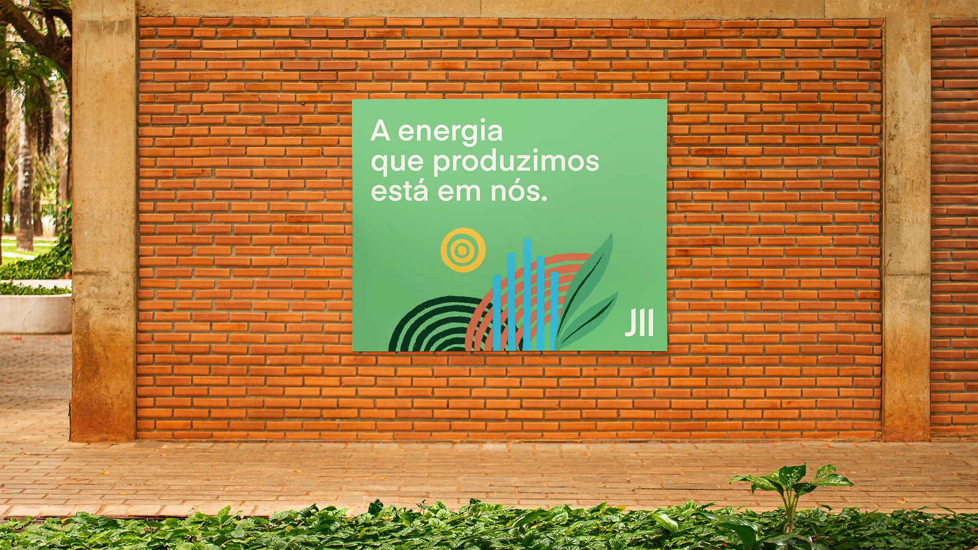
The graphic elements of the identity were created from the repetition of rectangular shapes, just like the Jalles symbol. The shapes repeat to create dynamic graphics that represent expansion, connection, like an energy that grows from the inside out. The lines and rectangles were created in three categories of graphics, which with variations in thickness can become more figurative or more abstract elements.
The greatest form of amplification of these elements is in the construction of the layout. We created modular divisions, made from expanded rectangles, which create spaces of separation between texts, graphics, and images. In this way, numerous composition possibilities are created, from cleaner to more complex, but always keeping every piece with the same guiding thread.


Jalles
FutureBrand Team
→ Creative direction — Lucas Machado
→ Strategy — Ana Virtuozo, Bruno Inokawa
→ Design — Sofia Ohanna, Lucas Machado
→ Illustration — Sofia Ohanna . Luisa Assaf
→ Motion graphics — Diego Jardim,
Francisco Fernandes
→ Fotografia do projeto / Case study photography – Sofia Ohanna
Rebranding project of Jalles, created to reflect the company's evolution after 40 years of history. The new identity reinforces its commitment to sustainability and innovation while preserving the strength of its legacy. A modern, warm, and flexible brand system designed to support its continued growth.